A More Open Open Space
Think of an open space … a vast open space with unobstructed views, multiple vantage points. Imagine how sound travels freely in that space (or thoughts for that matter).
Ahh … sounds amazing. Is this what you had in mind?

Previous designs of Open Space website: desktop version (left) and mobile version (right). Click to enlarge.
I remember thinking the previous Open Space felt extremely open and reader-friendly, and while it did serve us well for many years, the reality is that our expectations for reading on digital platforms have changed dramatically since 2013 — let alone 2008, when we first launched. Websites need to perform well across a variety of screens and devices, and they need to perform well whether you are using a mouse or a finger to navigate them. Ideally, all of this should also happen while maintaining a cohesive visual design throughout.
Text is our prima donna
We wanted the design to emphasize the contributors, the community, and most importantly, the content they produce. This is the reason the site exists, so creating the best possible reading experience, regardless of screen size, was our priority.
We chose a serif typeface best suited for reading on a digital platform, one that would complement our newly designed custom san serif typeface, SFMOMA Display.

Read more about FF Franziska’s wonderful curves here.
Responsive Hierarchy
Working on responsive sites means prioritizing what is important. In this case: the text. Beyond that, if something wouldn’t fit in a small screen we decided it was not meant to be there. As a result, the new Open Space is a lot cleaner, and should look just as good whether you are reading it on your computer at home or while you are on a bus on your mobile device.

Design specifications for various browser sizes.
Yes, images can be juicy and irresistible, no doubt, but we weren’t kidding when we said we wanted to give priority to the text. In the new Open Space, the homepage loads with no images — only text. The site is designed so that by either happy accident or conscious choice, the images will only appear when you hover over them with your mouse (or are scrolling on mobile devices). We have nothing against images — in fact, individual post pages will feature large images (much larger than on our previous site) paired with, of course, a larger font size and plenty of white space all around.
Structure
For the visual structure of the site, it was important to maintain the integrity of the original feed from the previous version. Since Open Space columnists have unique access privileges to the site, and can post at any time, our goal was to make sure their posts were featured prominently regardless of what other things were planned for the homepage.
With this in mind, we developed two additional columns that would stem from the RSS. Each column would have a distinctive approach and publishing tempo.
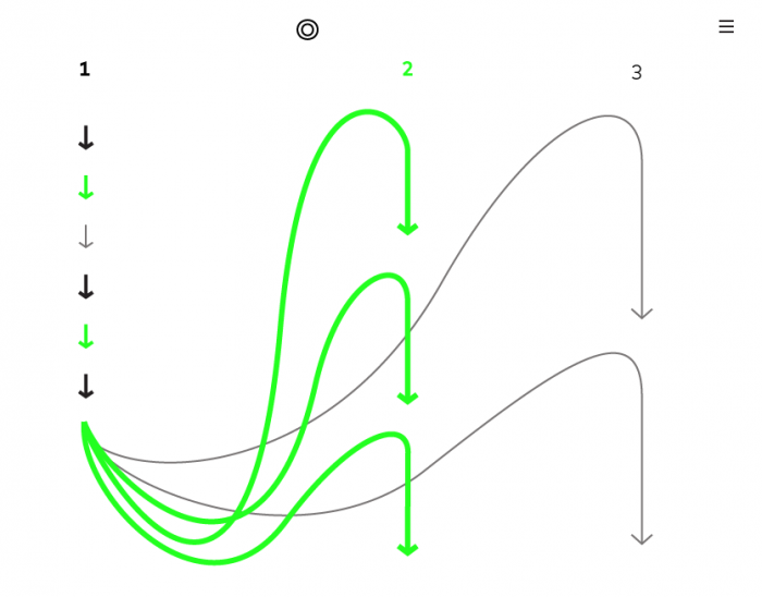
1. Free-flowing, unstoppable, and unfiltered.
The equivalent of the RSS feed in the previous iteration of the blog.
2. Time-based, people-based, topic-based.
A new seasonal issue of content organized around a specific topic would flow through the center column, highlighted by a colored background that would change depending on the season.
3. Community spotlight.
What used to be a static list of links will now feature posts highlighting people and organizations in the Bay Area cultural scene on a rotating basis.
A Fitting Mark
Open Space has never had an identity per se; in the past we used static typographic treatments in headers. The mobile site was simple but lacking an identity; we needed to fix this. We began with the mark, designing it at the smallest size first (which is very difficult with nine letters plus a space!). We landed with a responsive mark that unfolds over time (similar to the content throughout Open Space), from a transparent outlined O that resembles an open mouth.
O
P
E
N
S
P
A
C
E
My typography teacher once referred to stacked letters, like the ones above, as “hotel type” and made us promise never to use this EVER.
We like to think of the new Open Space logo as free and rebellious, and something of a party mingler — eager to chat with everyone in a room, reaching out to the person in the corner who doesn’t know anyone, or introducing people to the one who just arrived. But also a good listener, one who knows when to let others speak.
The design of Open Space reflects not only its own mission and values but is inspired by the philosophical transformation taking place throughout the institution as a whole. The ideas were drawn from conversations that began with the design of the institution’s new visual identity — an identity that is as much a mark and color palette as it is a way of thinking.
What I’ve found makes any open space compelling is not necessarily the space between things in it but the ability to discover them. When we do find these surprising vantage points or hidden nooks, they give us a sense of belonging, of being part of something larger than ourselves. I hope you spend some time wandering and discovering things.
•
I feel honored to have been given the opportunity to evolve the design of Open Space, and to participate as a contributor. This couldn’t have happened without the absolute trust and freedom given to me by Suzanne Stein and Gordon Faylor. Thanks to Jay Mollica, Maxwell Croy, and Zach Rubin-Rattet for the sleepless nights spent giving life to static, flat pages. Many thanks as well to Jennifer Sonderby, Chad Coerver, Keir Winesmith, and the rest of the SFMOMA web team for their support.
Comments (1)
luv your stuff bosco…what else do you create? paintings, sculpture, videos, drawings, weavings, ceramics, trouble?