The Personalities of Paint in The Steins Collect
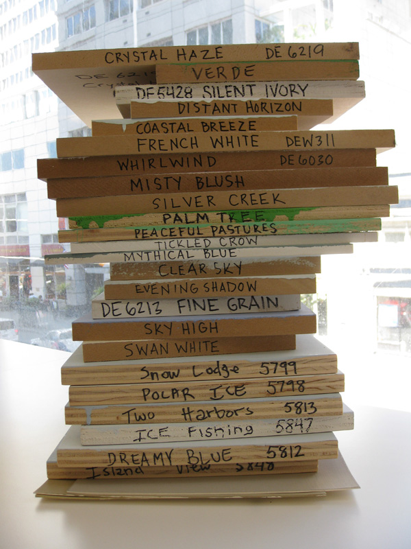
Blueberry Muffin, Cochise, Lake Placid, Soft Leather, Turtle Trail. Unlike the Stein family, the group of names that describe the paint on the walls of The Steins Collect: Matisse, Picasso, and the Parisian Avant-Garde are anything but modern. The hues, on the other hand, are another story.
In my six years at SFMOMA, I’ve art-directed the paint color selection for scores of exhibitions. Color can more often be found in the photography galleries — partly because black-and-white photography presents better on walls with less contrast and partly because the works tend to be smaller, requiring a more intimate atmosphere for viewing. The Steins Collect is the first painting exhibition to challenge the tradition of white walls throughout the spacious fourth-floor galleries since the exhibition Keith Haring: The Public Artist 13 years ago.
Meandering through Lake Placid to Cochise and back through Lake Placid, viewers weave in and out of the residences of the Stein family. The colors used in the exhibition were chosen for several reasons: to enhance the period feel, to signal thematic shifts in content, and to create a sense of intimacy in galleries with 18-foot-high ceilings.
For the most part, SFMOMA subscribes to the “white-cube” aesthetic, a trend in museum exhibition design since its introduction by Alfred H. Barr Jr. of the Museum of Modern Art New York in the 1930s. Barr sought to create an environment that presented the artwork as timeless, eliminating the saturated walls that were popular earlier in the century. Thus, 600 gallons of “SFMOMA White,” a specially formulated, soft white that neutralizes the color cast from incandescent gallery lighting, coat the walls of the museum each year.
There are a few opportunities to experience paintings placed upon colored walls in the museum, for instance in the Djerassi gallery of works by Paul Klee, which inspired one of the colors for the Stein exhibition. The walls of this petite gallery are painted an elusive gray called Silver Spoon. Silver Spoon shimmers blue when the artworks are placed against it, causing the pictures to appear to levitate. The illusion of floating and shimmering not only enhances the viewing experience but also creates a relaxing atmosphere — one that I find hypnotic.
Silver Spoon guided the choice of Lake Placid for The Steins Collect. One of the exhibition’s principal colors, Lake Placid is a soft, muted blue that reminds me of Crater Lake in Oregon on a cloudy day. (I have not had the opportunity to visit upstate New York to know if its namesake makes a better comparison.) The color complements the exhibition’s gold frames and the range of colors within the artworks, while at the same time it recedes into the background, allowing the paintings to take center stage. If only the Steins had known. Instead, the walls of rue de Fleurus wore a coat of peachy cream and terra cotta.
Early in the exhibition design process, two main thematic divisions became evident — the Stein residences (rue de Fleurus, rue Madame, rue de la Tour, rue Christine, and Kingsley Avenue) and nonresidences (everything else) — with two “sidebar” galleries in each wing. These organizational threads needed to be articulated with wall color.
We began experimenting with colors in the Selected Histories permanent collection exhibition on the museum’s second floor. The first gallery of this exhibition was ideal for this exploration, as it features artwork from the same time period and picture frames similar to those in the Stein exhibition. We taped 20 or so Dunn Edwards paint chips to the wall next to important paintings. It quickly became apparent that every artwork glowed with Lake Placid placed behind it.
Lake Placid was originally proposed for the galleries of the residences, with Cochise, a sympathetic taupe, for the nonresident galleries. After further consideration, the warmer tone of Cochise had a stronger connection to the Steins’ original walls, so we inverted the colors — Lake Placid would coat the nonresidential galleries, and Cochise would cover the residential galleries.
Once these two foundational hues were chosen, the other colors fell into place — all except the blue for the introductory wall. The goal there was to reference the bright blue that appears in The Steins Collect marketing campaign. However, the blue used on the street pole banners, bus sides, and other promotional materials throughout the city was too bright for the gallery spaces. Blueberry Muffin, a deeper, more muted variation, nailed it.
The perfect family of colors with an imperfect family of names was complete.
Jennifer Sonderby is head of graphic design at SFMOMA. Silver Spoon coats the walls of her bedroom.


Comments (2)
I share your thoughts Tucker and seeing the show after reading this post brought an unexpected dimension to the viewing experience – thank you Jen. I think some of my favorite posts have actually come from the staff, it all helps to de-mystify the museum as institution.
I like this post, Jen. For some reason, everyone loves a good look behind the scenes, it’s usually weirder than people expect. I think a museum blog that did nothing but really bring people into the working guts of the museum would be entertaining, fresh, and raise all kinds of questions about how museums operate, who they serve, and why they exist. Maybe others from the staff will follow suit? I know people go nuts for stories about artwork being craned in over other buildings and such. Also security guards get ridiculous questions from visitors all the time, but that content has no place to go.