Dushko Petrovich: Emigre
Emigre was initially a magazine about actual émigrés. Very few people remember it that way, but the revolutionary design publication actually was founded by immigrants — including husband-and-wife duo Rudy VanderLans and Zuzana Licko — in order to present “the unique perspective of contemporary poets, writers, journalists, graphic designers, photographers, architects, and artists who live or have lived outside their native countries.”
Five on Transition: Inspired by the shifting of seasons as spring arrives, we asked five guests to organize a series of works from our online collection, responding to the theme of transition. Please welcome artist and editor Dushko Petrovich, on the evolution of Emigre magazine.
Emigre was initially a magazine about actual émigrés. Very few people remember it that way, but the revolutionary design publication was founded by immigrants — including husband-and-wife duo Rudy VanderLans and Zuzana Licko — in order to present “the unique perspective of contemporary poets, writers, journalists, graphic designers, photographers, architects, and artists who live or have lived outside their native countries.”
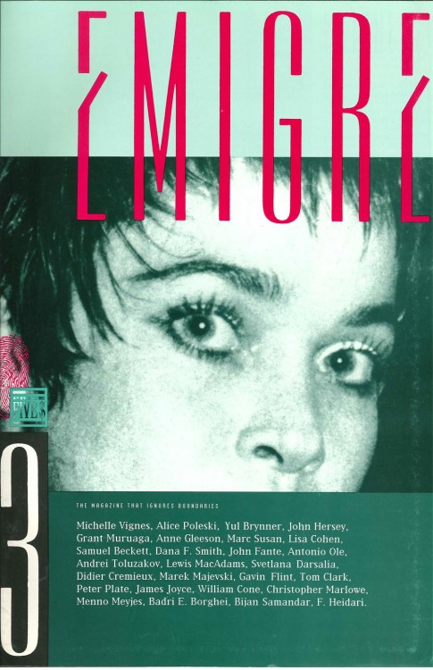
With an intended audience of so-called exiles, Emigre originally set out to be “the magazine that ignores boundaries” of a specifically geopolitical nature. Hence, the bold, passport-style thumbprint lurking past the threshold of the first cover. Notice, too, how émigré’s accents have stealthily migrated south, down into the letters themselves, where they resemble swinging doors. The first issue’s content focused on topics like moving to California and watching Sumo wrestling in Japan, but the typographic details foreshadowed Emigre’s further departures.
Emigre’s second issue, published in 1985, was the first to feature Licko’s own fonts. Having left Czechoslovakia as a child in 1968, the adult Licko emigrated (so to speak) a second time by boldly exiting the hegemonic realm of Swiss International design. Her parting words, oft-repeated, were brief: “You read best what you read most.”
Against the long-accepted dogma on legibility, Licko posited mere habit: our primary expertise is in getting used to things. So when texts began their tumultuous journey into the digital realm, Licko was a cheerful pioneer, quickly acknowledging that a certain refinement would be lost and fully embracing the rough new typographic terrain. As Licko herself put it, “The challenge was that because the early computers were so limited in what they could do, you really had to design something special.”
Emigre’s third issue was designed entirely on Apple’s brand-new Macintosh. The magazine still wasn’t about design, but in retrospect, what people see is the technology. Samuel Beckett and James Joyce may have been in the issue, but the computer was the issue. The question is, how?
The temptation, of course, is to point to all the layered elements, the bitmap fonts, and the general gridlessness before excitedly describing a watershed moment in the history of design. Since the first few Emigres present themselves as a perfect case study in the advent of the digital, I initially thought the fortuitousness of having the first, hand-designed issue was that it allowed for exactly this kind of direct comparison.
But the more I studied it, the more I saw the first issue as evidence not of a dramatic paradigm shift, but, more surprisingly, of continuity. In fact, it stands as a gentle reminder that Emigre’s program of “desktop publishing” actually preceded the Mac’s. In laying out pages and laying out the business, VanderLans and Licko were already practicing desktop accounting, desktop subscription, desktop inventory, and desktop design in a very literal sense.
Binary efficiency extended the life span of Emigre’s initial concept by several issues, but not even Apple technology could render its content — being out of place — viable for an actual magazine. Who subscribes to alienation on a quarterly basis? Change-of-address only begins to describe the problem. And if the hard-to-pin-down constitute a marketing demographic, who would advertise specifically to them? Immigration lawyers? Samsonite?
As it turns out, if your material is focusing on émigrés — as opposed to, say, immigrants — you’ll be featuring ads from local photographers, local boutiques, local galleries, local publishers, and other local designers. But Emigre magazine’s biggest client was the eponymous Emigre Fonts. Each issue featured the foundry’s new typefaces, in their sundry widths, sizes, and iterations, and the entire catalogue would be displayed next to the subscription page, where, like the magazine, readers could order it by mail (on a floppy disk). So it eventually made sense, both for business and for pleasure, to focus the magazine entirely on design, a shift that happened with issue 10, published in 1988, and continued through to issue 69, which came out in 2005.
Without wanting to discount the tremendous and unique contribution of the Emigre that everyone knows about and talks about and still thinks and argues about, I do want to say that I’m less impressed, on some level, by the hugely influential design magazine than I am by the failed and forgotten émigré magazine. This is despite the fact that I don’t particularly like how the émigré Emigre looks. Nor do I like any of the particular features, or the overall editorial approach of the émigré Emigre. It feels, I don’t know . . . hodge-podge, random, and scattered. How else could it feel?
But what I do like — and like is not a strong enough word — is the idea of it. Its design. Unlike most design, it does not set out to solve a problem. In fact, I think it set out to create a problem, or many small problems, which accumulate to the very big problem is of its own existence. This, of course, is a problem the magazine itself cannot solve. So it has no choice but to become a design magazine. It has no choice but to emigrate.
Dushko Petrovich left Ecuador when he was five years old. He left the United States at the age of 22, Italy at the age of 25, Denmark at the age of 27, and England at the age of 31.
View the Five on Transition series here.


